Diderot Project
Limited Edition Book
Edited, written, designed, and printed by Ken Botnick, emdash, 2015

Letterpress printed in an edition of 70 copies. 150 pages with 6 different paper types including papers with watermarks designed for this edition made at Dieu Donné Paper. Bound in handmade papers over boards by Daniel Kelm with modified sewn boards structure.
Inquire about availability and price.
Watch a video of my presentation at the Boston Atheneum October 1st, 2015.
Transcript of my talk from the annual Enid Mark Lecture
Smith College
April 23, 2015
The process of making this work could be compared to that of weaving: the warp of my book would be the images and texts of the Encyclopedia; and the weft— the threads moving over, under and through the warp— was spun from the two primary research interests that predated my work with the Encyclopedia.
The first of those research threads developed in India in 2003 when I made the first of many working trips there, including during a Fulbright fellowship in 2006. My research in India is focused on the relationship of craft to Indian culture, particularly the relationship of people to tools and objects, and to the role of color and pattern in everyday life. India was the catalyst for me to begin writing critically about design thinking, and that practice— writing— has had a profound effect on the way I work in my studio.
The second thread is my research into visual perception— including cognition and memory— and the role it might play in design education. The links between these two threads of inquiry— of craft and cognition— are combined, for me, as two components of perceptual learning, a subject that was at the foundation of my work with Diderot.
Diderot Project compares and combines those two bodies of research with my study of the Encyclopedia plates and texts, exploring them in the way that is most natural for me— through the landscape of the two-page spread of a book. What eventually became Diderot Project is not a book about the Encyclopedia of Diderot as much as it might be described as being a book of the Encyclopedia, or with it, or, even, because of it.
Before I go further, here are the production details. The book is 150 pages and 11.25 x 7.25 inches. It required 220 press runs using over 8 lbs. of silver, black, gold, and transparent inks. The illustrations are extracted from the plates of the Encyclopedia, interwoven with the texts of 40 authors. The two primary authorial voices are Diderot’s— in the form of entries from the encyclopedia— and mine.
There are 6 different papers used, including a special edition of hand made paper with watermarks I designed based on the engravings. The cover is hand made flax paper, made by Cave papers, that is triple dyed in indigo and walnut to obtain this quality of black. I chose the flax paper because it is especially tough and actually looks better the more it is handled, eventually taking on the quality of leather.
There are three sections in the book. The first is on the subject of the hand; the second, the object; and the third, the senses. I refer to those sections of the book as volumes, a reference to Encyclopedia’s 28 volumes, though in my book they are bound as one binding.

A common misperception of the process of making a book goes like this: once you have thought deeply enough about a subject you then pour that fully formed idea into a vessel called book. This is, of course, not how it works. When you make a book you discover your subject, and that discovery unfolds, enriches, and expands through the process of writing, designing, editing, and making. For some of us, the unfolding leads to the making of an artist book.
It’s no secret that books and publishing are in a period of dramatic transition due to digital publishing. Reference books, in particular, will soon be completely virtual. In fact, we can say with (almost) certainty that there will be no future printed encyclopedias. I don’t say this out of alarm or even lament. I’m not an antiquarian. And I’m not opposed to e-publishing; it makes a lot of sense, especially environmentally. I think the most important reason to study this transition is to understand how it represents a shift in our cultural perception of authorship. The reference books of the past are manifestations of the way an author thought—at a particular point in time—about a world of things and ideas organized schematically for a reader, a reader who would then use that information to make her own correlations. The real interest is not just in the “what” of the information that is compelling, it’s the “how” of it, — its method of meaning for the reader.
So, is there a role for the artist book in this moment of change? Before we can answer that we need to answer another question: what is an artist book? The easiest way for me to define the term is by analogy: artist books are to the world of books as poetry is to the field of writing. They don’t follow the same rules as the rest of the field, they are generally much shorter, have a high degree of craft to their making, and their distinct visual character is not only conceived as essential to their message but as an expression of their authorship. (And, they have about the same size audience as poetry does).
The proliferation of the artist book during the 1960s and 70s was a reaction to the market systems of publishing and art, an expression of the artists’ desire for a more democratic distribution of ideas. These were typically high concept and low production affairs, decidedly low production values. Ed Ruscha’s books of photographs are a good example: His 26 Gasoline Stations was not only inexpensively produced, but sold at the very gas stations pictured in the book.
At the same time there was a movement referred to as “fine press” that sprung up around the craft of letterpress printing, with presses producing books that were primarily traditional in format, low in concept, but with very high production values, including handmade papers, hand set metal types, and hand binding. The two practices, artist books and fine press, were, at times, almost mutually exclusive. The practices did not meet for quite a while, but have grown closer recently. Today, book artists (we might also call them printer/publishers) are taking ownership of content and concept, exploring thematic complexity while employing the full range of materials and techniques of the book arts. It feels to me as though we’re in a golden age of the artist book, a time when concept is not coming at the expense of craft, but is enriched by it.
The virtual was supposed to have killed off the analog book years ago; instead we find the demand for well-crafted books growing, signalled also by an impressive growth in demand for courses on the book at colleges and universities across the country. We might be in a period analogous to the late 19th century, and the fear that photography would kill painting. That didn’t exactly happen— but it did push painting into other important areas of expression. I think we’re experiencing, today, a similar phenomenon in the production of books.

During a meeting of my History of Design course in the Washington University Special Collections, I had pulled, as usual, some of the plate volumes of the Encyclopédie of Diderot.
We had a few of the plate volumes spread out before us discussing the artistry of the engravings when one of the students asked if she could turn the pages. I told her she could, but to do it very, very carefully, and she said, “well, it’s good they’re in the library because they’ll be protected and safe away from people.” I responded “yes, but that is only one function of the library, to keep things safe. The other, and maybe more important function, is to have the books available for you so you can use them to produce work of your own that is inspired by and a response to them.” When I heard myself speak those words it occurred to me that I had not worked on a book planned as a direct response to another. I also realized that the way for me to understand this Encyclopédie more deeply was to take it on as a project. While I knew there was a lot of material ahead of me I didn’t know at that moment how long it would take to make this book. About 4 years. But it did prove true: when we make the book we discover our true subject.
I usually try to get the students’ attention with some of the more commanding plates, like this one of the flea seen through microscope. This is an important plate in the Encyclopedia because it is one of the few that employed technology, in this case the microscope, to resolve the subject at such a dramatically different scale. A detail of this image appears in the final section on the senses.
The exotic plates, of animals or anatomy, are probably the most familiar, and the easiest to identify with Diderot. But one of the changes that took place as the result of my research is that while I began with some of the more spectacular subject matter, like the flea, I soon became absorbed in the plates of the more rudimentary, everyday processes and objects, and they are the core of the book.

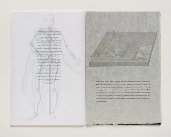
I began my work with the encyclopedia as a visual exploration of the plate volumes through the lens of the camera. I deliberately avoided reading the mountains of literature on the encyclopedia because I didn’t want to color my thinking about where I might go with the project. The plates are visual essays unto themselves that demand a different kind of reading than we have become accustomed to. As you can see there is no caption text on the plates— the figure numbers are referenced to the texts but often would have no more details about the plate than the name of a particular object or tool.
In this plate of the needle maker’s shop we see the organizing system of those plates dealing with the trades— and more than half of the total 3,129 plates are of the trades, a clear indication of the value Diderot placed on them. The vignette at top represents the workshop and the people in it. We see the positions and postures of bodies, as well as the environment, including windows, etc. The larger, lower part of the plate shows individual tools and apparatus floating in white space— in graphic contrast to the pictorial quality of the vignette above it. Everything (except the people) portrayed in the vignette is then shown separated out in the lower part of the page, and on following pages, but the scale shifts dramatically and the detail is greater. Small things can be shown quite large and larger things are sometimes small. To make sense of it we need to correlate with the vignette to understand the proper scale relationships.
This system is a little counter intuitive. The density of the vignette should require more space, not less, than the area below. But Diderot assumed that information could be obtained by the combination of an intuitive scanning of the vignette, and a more specific reading of the details in the area below. He also understood that the careful reader had the opportunity to correlate information from one plate to the next, making comparisons of tools and techniques, spurring even more invention. The encyclopedic system for Diderot was one of innovation and progress, not a static display of goods and information.
Two visual qualities of the plates shaped the way I used the engravings on my book pages. First, the scale shifts that occur between different elements—I wanted to explore scale in the expression of type and image, not only by making jumps in the size of the plates themselves; And second, the use of white space around the objects was employed as a dynamic compositional device.
After each of my photo sessions I organized my digital photos into virtual folders by category and common theme. By observing what I was taking pictures of— by following my own eye— and cataloguing the results of the photo sessions, categories emerged that were consistent with those values central to my work: the role of the hand as sensory instrument, the presence and importance of objects in culture, our essentially human relationship to tools, the nature of craft, visual sensation and perception, and the construction of memory.
Exploring the plates through the camera was the best decision I made. It allowed me to see more deeply into the plates and freely select details to extract from the plates and weave into the narrative.

On the title page of the Encyclopedia of Diderot we find two word groups that shaped my thinking throughout this project. First, the words “Dictionnaire raisonné” or, systematic dictionary. A reference book is as good as its system of organization. The information in the Encyclopedia needed to be more than merely available, it had to be systematically usable and referenced. Diderot’s strategy was revolutionary because of the system of correlations and references he hoped would be the natural outcome for the reader, resulting in new networks of meaning and inquiry. The volumes were organized by subject category to allow the reader to compare and contrast plates and texts. That systematic organization extended to the visual composition of the engraved plates themselves, which we’ll see in a minute.
Second, it states just below Dictionnaire Raisonné, this is an encyclopedia of the sciences, the arts, and the métiers, or the trades. This was an extremely important distinction by Diderot about this work, that the trades were, in a way, equal to the arts. Diderot, son of a toolmaker, viewed the crafts, les métiers, as one of the sources of the richness of France— not just materially, but intellectually. He felt there was a particular genius to be found inside the workshops where hand knowledge superseded symbolic knowledge. He saw the workshops as hotbeds of experimentation and innovation, and lamented that in 18th century France those who worked with their hands and produced so much value to culture were considered by the elite to be of lower standing.
This, of course, had political implications as well.
The working people in the encyclopedia were glorified as the true citizens of France. When we do see images of the elite they are often portrayed as supercilious and effete. Diderot was attempting to ignite nothing less than a revolution with this book, and portrayal of the working people was one way to instill in the hearts and minds of readers just who was of value to the future Republic.

While the images from the Encyclopedia are compelling, taken alone they couldn’t tell the full story that was beginning to emerge. The point of this project was to use the encyclopedia plates as departure point, as catalyst, not as an end. The process of defining the text that would modify/translate/interpret/and challenge the images then began in earnest with my study of the Preliminary Discourse to the Encyclopedia, in which the authors lay out their organizational structure in this diagram, called the System of Human Knowledge. The System, a marvelous piece of information design organizes Encyclopedia entries in “nested” categories under three uber categories, Memory, Reason, and Imagination.
Finding key references in the Discourse led me to search the main Encyclopedia entries for passages I might adapt to the pages of the book. During that process I was struck by the modernity of the language and ideas in the Encyclopedia, and soon I was experimenting with the juxtaposition of contemporary texts on the same page as Diderot’s. Favorite authors like Barthes, Foucault, Pamuk, Bachelard, Mumford, Flusser and others served at times to complement the original texts, while challenging it at others.
A division of 3 became an organizing component, both conceptually and formally, and this organization is consistent with the Encyclopedia’s system, but with different reasoning behind it. Diderot places the trades under the classification Natural History, a sub-category of Memory, because of their dependence on natural materials. To my thinking, the practice of craft and the subject of hand are inextricably linked— as is the hand with the concept of memory. Many of our first memories were born in the hand as we explored the sensual world of objects and materials.

These are just a few of the many images I selected for the volume on the hand. I want to stress that it was not a process of looking for plates about the hand per se, but selecting those plates that employed the hand to illustrate another process of making. It was in these plates I found the articulation of the hand to be most beautiful.

And this was the signature image of the hand that I adapted for the watermarked papers. Twisting fibers was one of the earliest methods used to manipulate materials in order to improve it for human use, so this image binds the intelligence of the hand with material manipulation.


I think a lot about the nature of objects and their meaning. This includes objects of everyday use and utility and those objects that are symbolic. I am fascinated by the articulation of everyday things; the care makers expend to create an environment that is personal, individualized, and special. The Encyclopedia is a massive catalogue of ordinary things often transformed into things of subtle beauty, like the lock made in the shape of the heart.
The second volume, or section, of my book is focused on our relationship with objects, tools and machines, and by extension, labor and leisure.

To make objects we need tools. The tools here are simple and knowable. This is one way of distinguishing a craft-based, local economy from ours in which objects are made by people we don’t know, in distant places, and in conditions we’d rather not see— all in the name of achieving the lowest possible cost. The objects we use have become opaque to us— think of your smart phone, for example— we don’t understand how they work, or who made them, or what the true costs of making them really are— and so, as a result, they feel disposable.
Two tools emerged as the UR tools of the Encyclopedia plates: the hammer and the divider, or compass. They are both found throughout the plates in an incredible array of shapes and sizes.
The hammer is found in almost every plate on the crafts, in every possible form. It is the extension of the hand that lends weight and force and steel to the conversation between mind and material.


The divider, or compass presents a clear contrast to the hammer. It shapes nothing. It simply gathers information and takes measure of the world. In that sense it might be considered the more modern idea of a tool, the information-gathering type we’ve come to rely on in our 21st century lives. But it’s interesting to me that while the hammer hasn’t really changed in the time since it’s ancient origin, by comparison the divider came and went rather quickly. Our tools have become of shorter and shorter duration and we’ve been conditioned to think of that as a value. While I view my 60-year old printing press as my rather young accomplice, it seems like a mysterious relic of the industrial age to my students.


Here is the second watermark from the volume on objects showing a divider, or compass.

The image of the cube that can be perceptually flipped, to appear protruding or receding, (what we now call the Necker Cube), was a favorite motif for pattern makers of floor tiles. For me it felt like a perfect opportunity to explore an aspect of visual perception in the final section on the senses and how we can render something in 2D with the visual properties of 3D.

And here is the way it works inside the book, a play on the shift across the gutter of the page with the 3D cubes on the left flattening across the gutter to become the checkerboard pattern. This notion of shifting, changing one’s perspective, became an idea that I wanted to explore in the physical structure of the book. The diptych created by the two-page spread represented a space where I could explore the possibilities of a change in perspective, conceptually, formally, and materially, as the eye moved from left to right across the spread.
This third section addresses visual perception, patterns, dreams, the animal world, and the importance of shifting one’s perspective.

I included this image of the camera obscura in the section on the senses because it continues the theme of perceptual flipping, as the image shows here. But it also explores the use of instruments that help us see more than we are capable of seeing with the eyes alone. And I wanted to include it as a sort of homage to the origins of this project in the camera.


I also love the people and places in these plates. The workshops are portrayed as places that are probably more hospitable than they actually were— probably grim, dank and dark. The faces of the young workers are pictured as youthful, even childlike, while their bodies, muscled and taught, appear to be the product of years of labor. And the dress is sometimes very difficult to reconcile with the activity: here, we find a lady dressed as if she’s going shopping immediately after she smoothes out this roll of lead, (which is what she’s doing.) To what degree these images were propagandistic, or even wishful thinking, portraying the noble workers who might inherit positions of power in the next republic, that is a question we cannot answer.

So, let’s take a closer look at the book itself and the strategies behind its making.
I am fascinated by patterns, both visual and conceptual. My research in India has helped me see how we are, innately, pattern makers and perceivers— it’s the way we bring order to our world, by arranging objects, or concepts, into groups, making them accessible, knowable, and usable. In a pattern we group things in a space we call a field, and that space between things, the field, is of a perceptual importance equal to the things themselves. It is those spaces “in-between” that hold great power for me when I think about design of books.
When we make a book we are making patterns— visually and conceptually— so a central theme of this book is patterns— the meaning we derive from them, and the pleasure we take in making them.

The formal construct of 3s also drove some of the visual devices, including these gridded typographic constructions of the word ENCYCLOPEDIA, which repeat almost mantra-like throughout the book, but morph through several iterations. These function as markers of a conceptual shift in content, and reflect on the definition of the word encyclopedia, a chain of knowledge.

In this version the Encyclopedia plate transitions from fully transparent at top to fully opaque silver at bottom.

My challenge is creating a book in which concept, design, and production are in balance. For a design to be successful it is important for it to communicate on a metaphorical level, and designing those visual metaphors becomes one of the principle goals. There are two fundamental design concepts in the book. The first is the use of transparency, achieved through inks and papers. And the second is the typographic matrix of the content.
First, transparency. This was originally driven by a desire to interpret one of the most important of Diderot’s revolutionary concepts in the Encyclopedia— his call for a more transparent society that endorsed a free currency of ideas for all citizens.
The transparency of the inks and papers allowed for a cinematic unfolding of ideas—as pages turn, the visual composition, and sometimes meaning of the image itself, transforms and grows in complexity.
Transparency also acts a metaphor for memory in the sense that memory is constructed not of discreet experiences but in layers of one experience over— and influencing— another. I found the watermarks to be especially evocative of this kind of memory— the image itself being the residue of the thinness of material in that one spot.
It’s one thing to design for transparency and another to make it work in material. The paper on the right is a commercial vellum called UV Ultra. To print letterpress on this paper requires a completely different approach than printing on rag paper— the inking requires multiple layers of thin ink before each print and the press can only deliver a kiss impression to the paper, otherwise the ink squishes, bubbles and everything else you don’t want it to do.
There are sequences in the book in which you are reading through up to 4 layers of paper surface, as you are seeing here.
This was an important moment in the book where the choice of typeface established a sense of the monumental and structural, capable of holding a place alongside the images.


At times I wanted to challenge the paper qualities. The paper on the right is that same vellum, this time printed in such a way as to make the transparent opaque. There are several sheets in the book that were printed on one side of the sheet in order to achieve the quality of the image on the non-printed side. What appears as white type here is printed on the opposite side of the sheet in a solid silver-black with the letters reversed out of the plate.

Here you can see the opposite side of the sheet and the way it’s printed. This sheet proved to be the single most difficult of all pages in the book, moving through the press 10 times in total.

The first volume, The Hand.
As mentioned earlier, Diderot considered the workshops a great source of France’s wealth—not merely for the products they made but for the particular “knowledge” that is the product of working with one’s hands. He understood this from birth— his father was a master metal smith and maker of surgical blades. I think this explains the emphasis on rendering the artisans and their workshops in such intimate, almost loving, detail. Diderot’s lament of the tradesman’s status is clear when he writes: “We are all too inclined to believe that it is beneath the dignity of the human spirit to apply oneself diligently and continuously to specific and concrete experiments and objects, and that our mind forgets its dignity when it descends to the study, let alone the practice, of the mechanical arts; the mind here stoops to questions in which research is laborious, reflection inglorious, and exposition difficult; This prejudice has tended to fill the cities with useless spectators and with proud men engaged in idle speculation, and the countryside with petty tyrants who are ignorant, lazy and disdainful.” I love his fierce voice and condemnation, and he is pretty accurate with his characterizations.

As the images and texts were coalescing into a narrative I developed a robust typographic system, or matrix, that would accomplish three things: first, it would create a strong visual contrast to the images; second, it had to reflect different voices on the page—using the typefaces Walbaum for Diderot’s writing, and Trade Gothic for the contemporary texts— and third; it would infuse the subject of the individual volume with its own typographic identity. In the first section, the type is shaped with soft curves to evoke the sense of material shaped in the hand.

The second section has the sharp angularity of a material shaped by tools. The final section has a typography that, at time, challenges the visual perceptual system and the way we read.
The typography is shaped throughout the book, sometimes subtly, sometimes more aggressively. But the goal wasn’t to make shapes or pictures out of the words, as much as it was to mold and animate the space surrounding the words, to activate it as a metaphor for the spaces in which I believe correlations, associations, and imaginative leaps are actually made. I liken the spaces between the printed things on the page to the synapses between the neurons in the brain, those electrical bridges that make connections come alive.
This complexity demanded a design matrix that could maintain continuity while being adaptable to improvisation. I was designing each signature as we were printing the previous one. This isn’t a system that I would recommend — but it lent a tension, and risk, to the production process that I had never experienced before, and liked. I’d wanted, for some time, to develop a project in which I could improvise on a theme as I went along. The model for this form of improvisation, for me, is John Coltrane and his version of the song “My Favorite Things” from the Sound of Music. At the beginning of each book design course I teach I play a recording of Julie Andrews singing it, then I play Coltrane’s version, telling the students that everything they need to know about book design can be found in the way Coltrane employs the theme and improvisational variations in his playing.
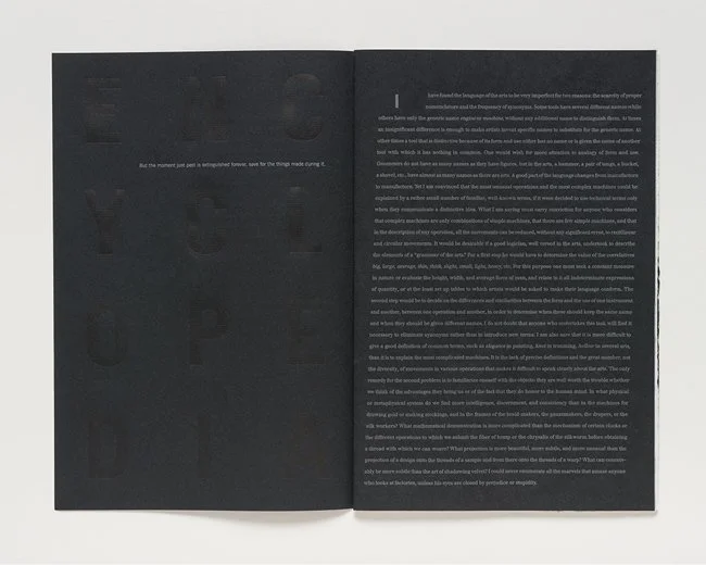
The blackness of the paper became an important aspect of the visuality because of the way images appear to invert when printing them in silver ink on black. It was also a way to challenge to my own system, because light printing on black paper simply does not behave the way black type on white paper does.

Reading, photographing, and organizing the plates of the encyclopedia I realized that Diderot and I were looking at some of the same phenomena— the hands, tools, and body postures, of the makers. We both saw the workshop as places of insight, doing what humans do extremely well— giving form to things. The encyclopedia plates emphasize the artisans and the way they worked not the products of their labor. The artists who drew the encyclopedia plates were instructed to go to the workshops and observe without confusion, because they could not expect explanations from artisans who were not used to discussing their process. In 1750, writing in the Preliminary Discourse to the Encyclopedia, Diderot’s co-editor, d’Alembert explains this with one of the most beautiful lines ever written about studio practice that you see on the left page. On the right are some of my Encyclopedia friends.
The Encyclopedia was, at its time, the greatest gathering of images that had been accumulated into one project. If we think about an “ecology of images” meaning how an image fits into larger systems of cultural meaning, and how we might assess its lasting value, it is possible for us to imagine what these plates might have meant for their readers. But compare that with our current condition, and the ubiquity of digital images: we have quickly become accustomed to considering images as consumable and disposable commodities. Searching images, we are constantly propelled forward, swiping feverishly to get to the next image, usually lingering only long enough to register how audacious an image is or that it received 50,000 hits in the last hour. I am certainly not a technophobe; this entire project is the product of various forms of digital media. But, as I said in class the other day, I’m not interested in the number of hits as much as the number of dwells.